of course, but i need to know which of the 3 look best and if any are preferable to older posts or different from the last 2 days. please choose 1 or 2 or 3.
I think any of them (or the mysterious deleted fourth) would look good if used consistently. What jumps out at me is when a drawing is suddenly darker or more processed than the previous forty. And that’s not even a bad thing…just something I tend to notice.
When I scan something it’s always my intention to get the scan to look as much like the original as possible. So I guess if I had to pick a level of processing, I’d go with the one that looks most like the drawing it represents.
“processed 1” was scanned with some settings on high and jumps out at me a bit but i honestly don’t know why the others stand out. i don’t care too much about fidelity but i do want consistency.
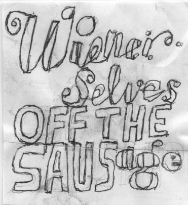

nobody should watch art or sausage being made
choose your grind (1) (2) or (3)
I am being controlled
of course, but i need to know which of the 3 look best and if any are preferable to older posts or different from the last 2 days. please choose 1 or 2 or 3.
I’m pretty sure there were four processsesses this morning.
which one of these three look best?
i played with the settings after your comments
I think any of them (or the mysterious deleted fourth) would look good if used consistently. What jumps out at me is when a drawing is suddenly darker or more processed than the previous forty. And that’s not even a bad thing…just something I tend to notice.
When I scan something it’s always my intention to get the scan to look as much like the original as possible. So I guess if I had to pick a level of processing, I’d go with the one that looks most like the drawing it represents.
“processed 1” was scanned with some settings on high and jumps out at me a bit but i honestly don’t know why the others stand out. i don’t care too much about fidelity but i do want consistency.